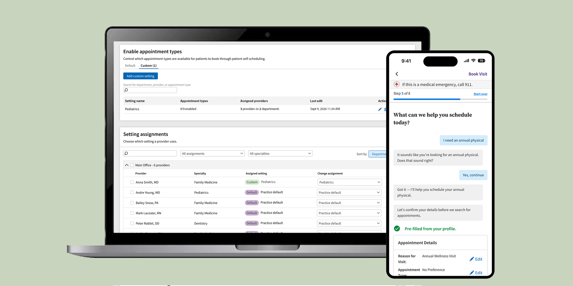
Replacing a decade-old dropdown with a system that actually understands what patients need.
Neither the setup nor the patient experience for our self-scheduling product was made with our users in mind. The admin side came from an acquisition years before I joined the company. The patient-facing UI was originally built for call center agents — not patients. The result: an admin experience spread across confusing, disconnected screens, and a patient flow where people would switch drop-downs over and over until they found any open appointment — often the wrong one, creating far more work for staff than if they'd just called in.
When a schedule gets messed up because the patient didn't book themselves correctly, it erodes trust. Clients would rather just turn off patient self-scheduling than risk losing control over their schedule. Only about 1,000 clients (less than 10% of our business) were using our patient self-scheduling solution. But the business stakes were rising: virtual-only clients wanted to sign contracts, and none of them would without patients actually being able to book in a modern and reliable way.
It was so bad, most clients could not or would not handle setup and changes themselves, causing hundreds of hours of labor for our onboarding teams.
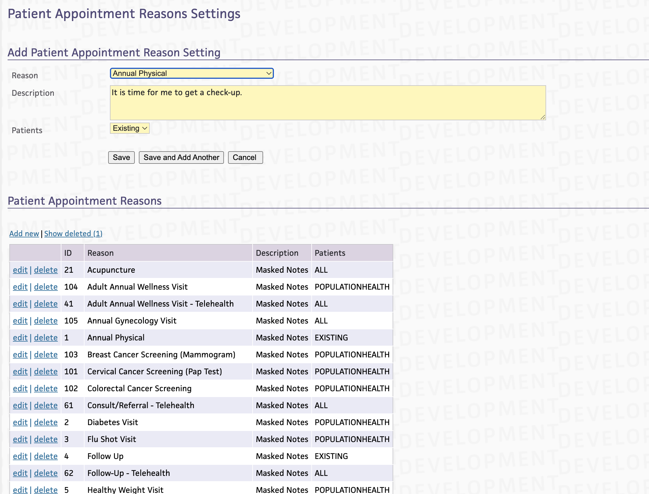
Step 1, choose which Patient Appointment Reasons (PARs) the practice will use to present appointment options to patients online.
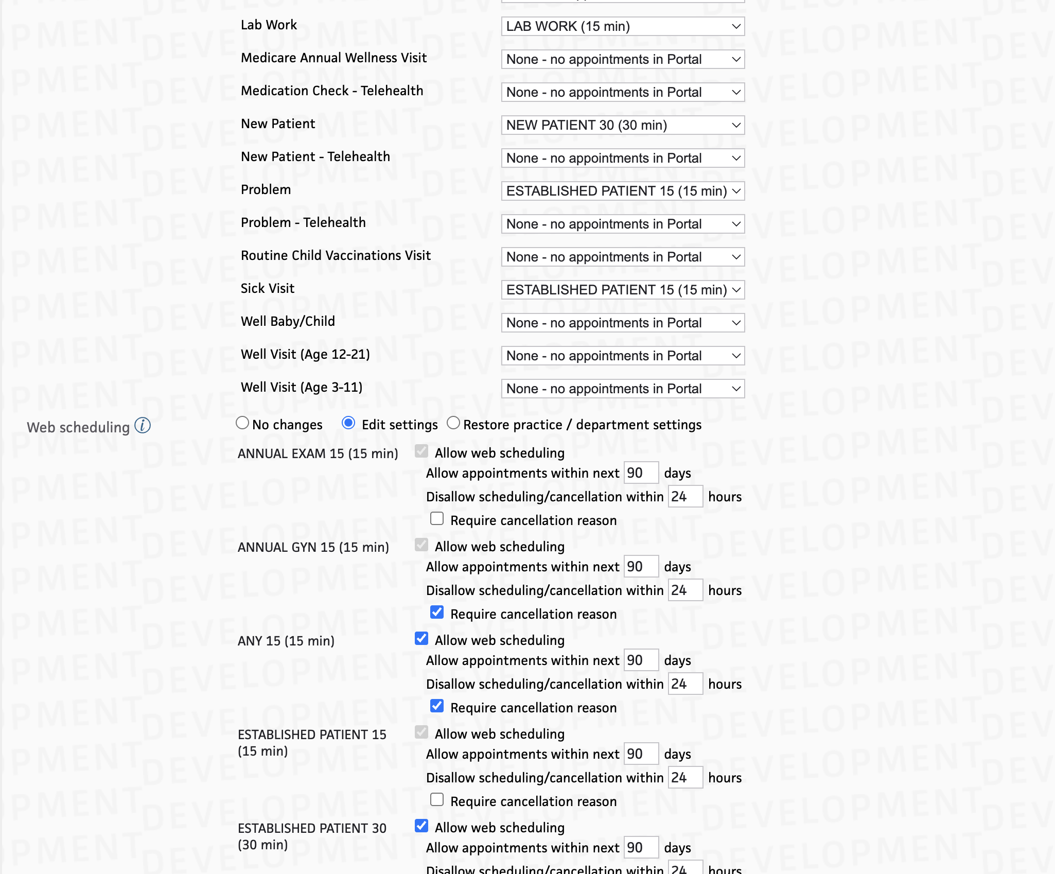
Step 2, navigate a tangled web of an admin page to map PARs to appointment types, create parameters, and setup configurations for different providers.
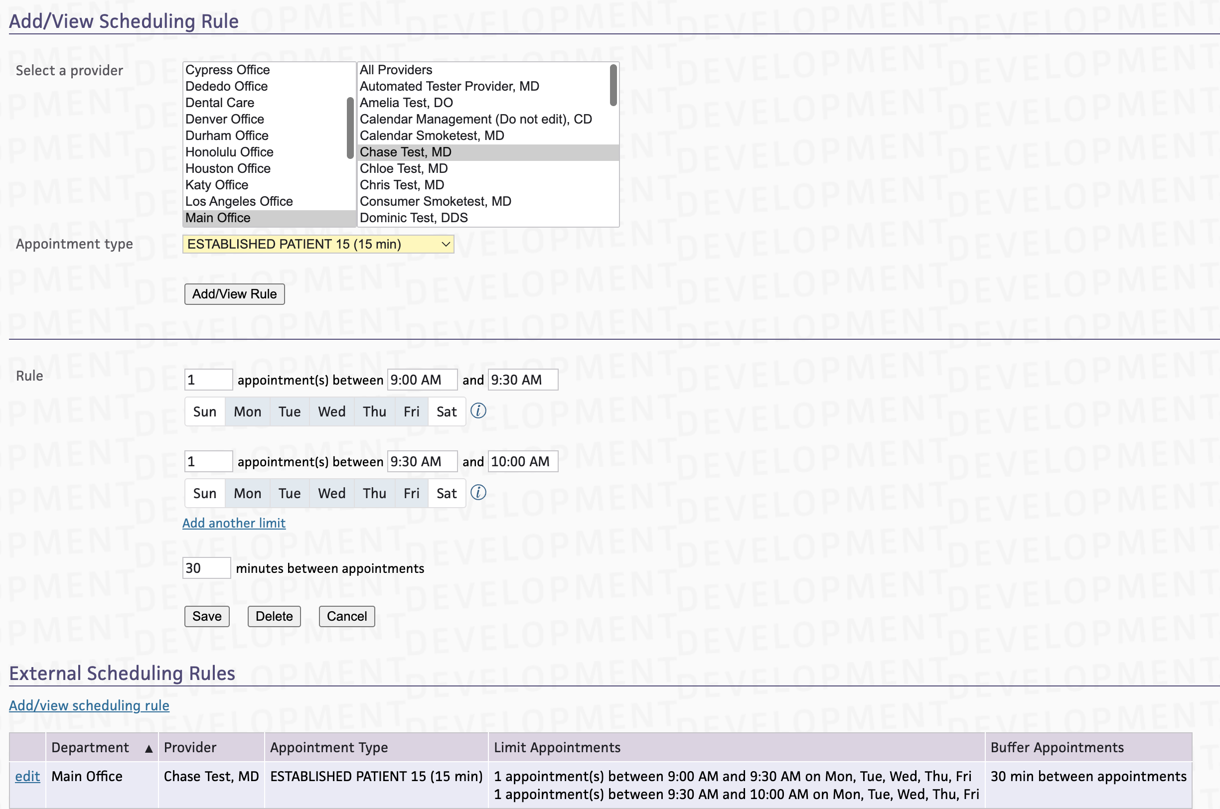
Step 3, an optional step to setup limits on appointments scheduled through PSS, but barely any clients know it exists.
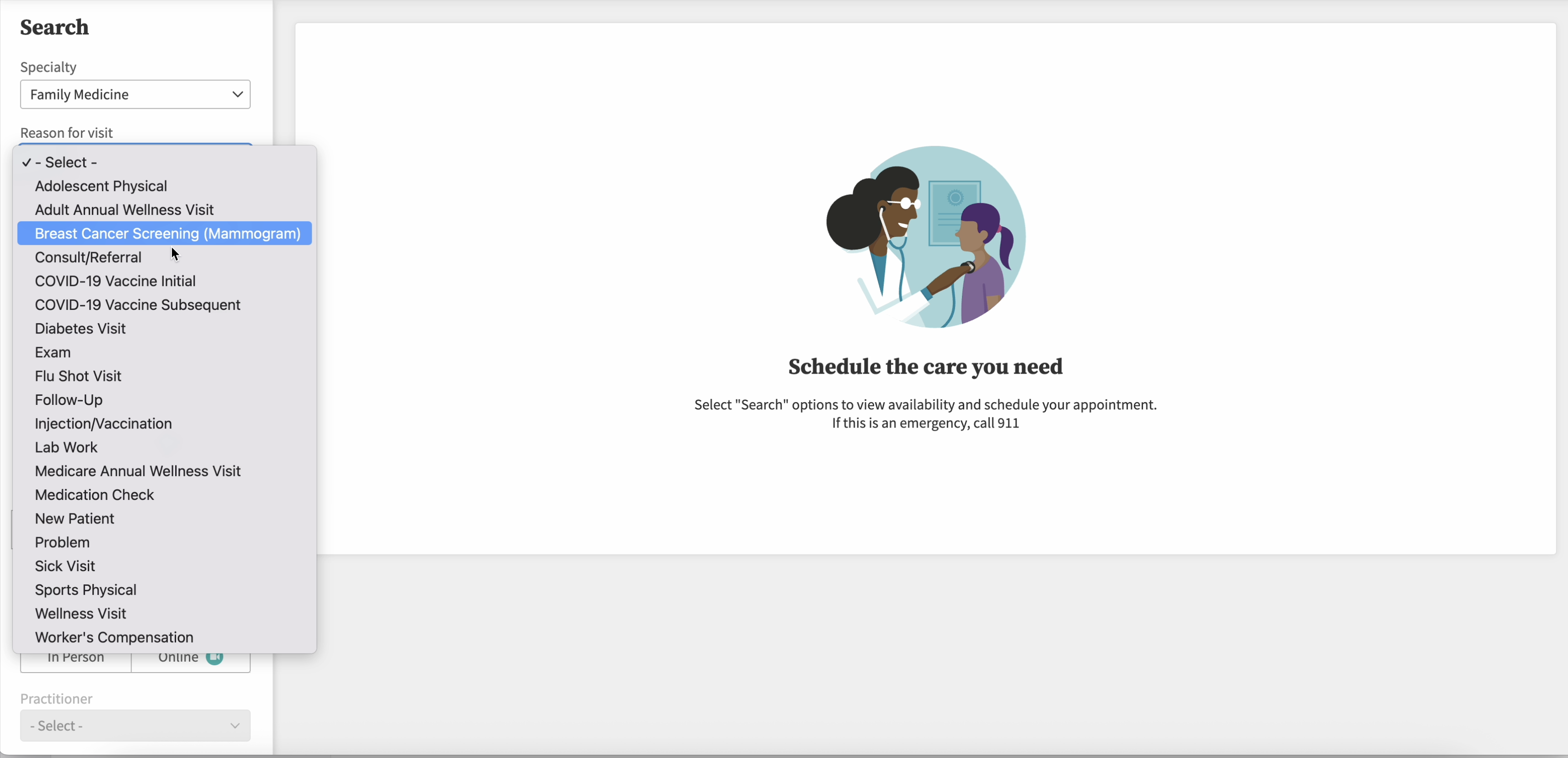
Patients choose their reason from a dropdown. Since different dropdown options map to different appointment types, a patient being disingenuous about their choice to find a sooner appointment ends up with the wrong slot.
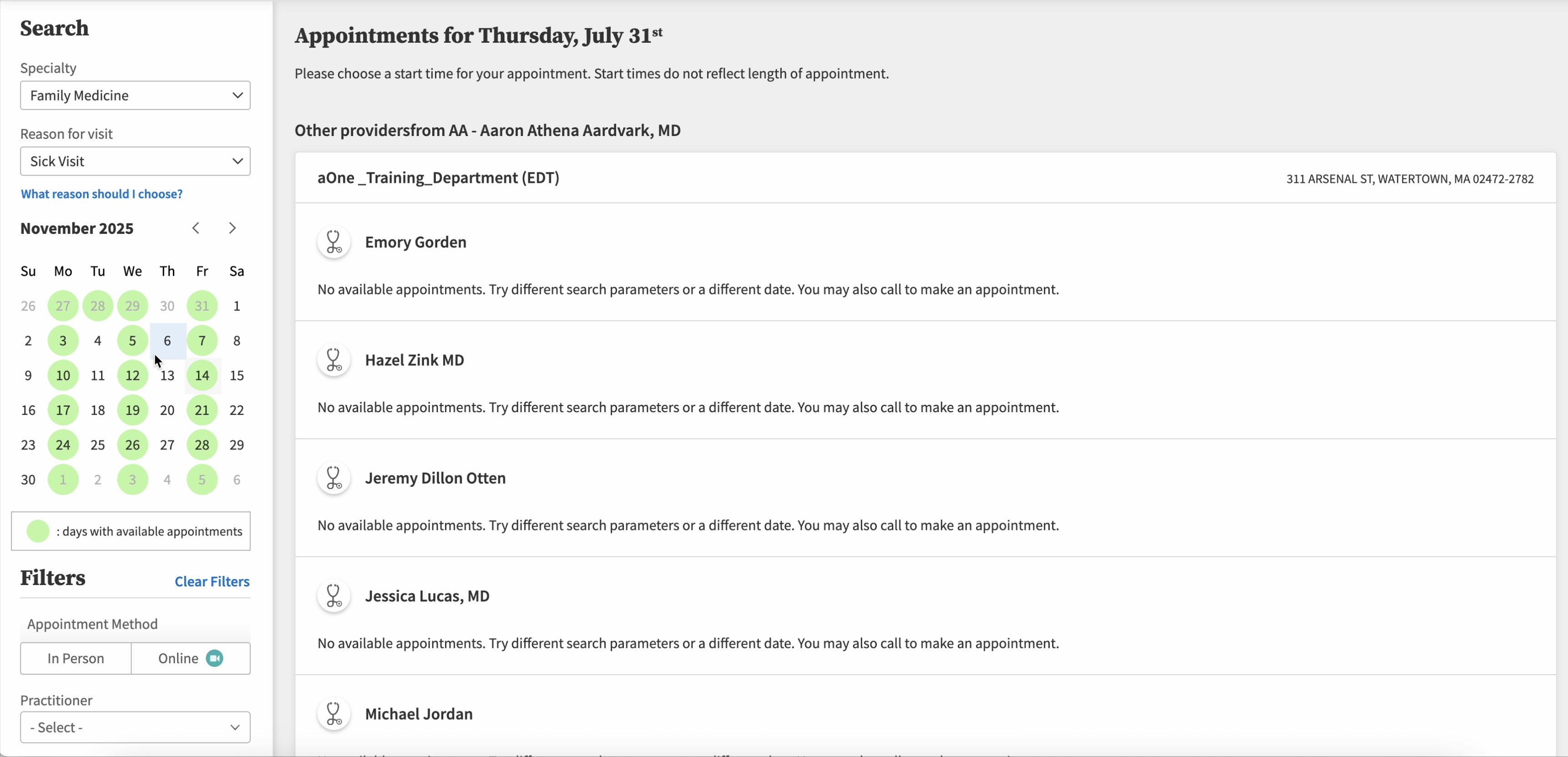
The sorting of results and lack of "Next available" buttons makes it cumbersome to find availability and frustrates patients
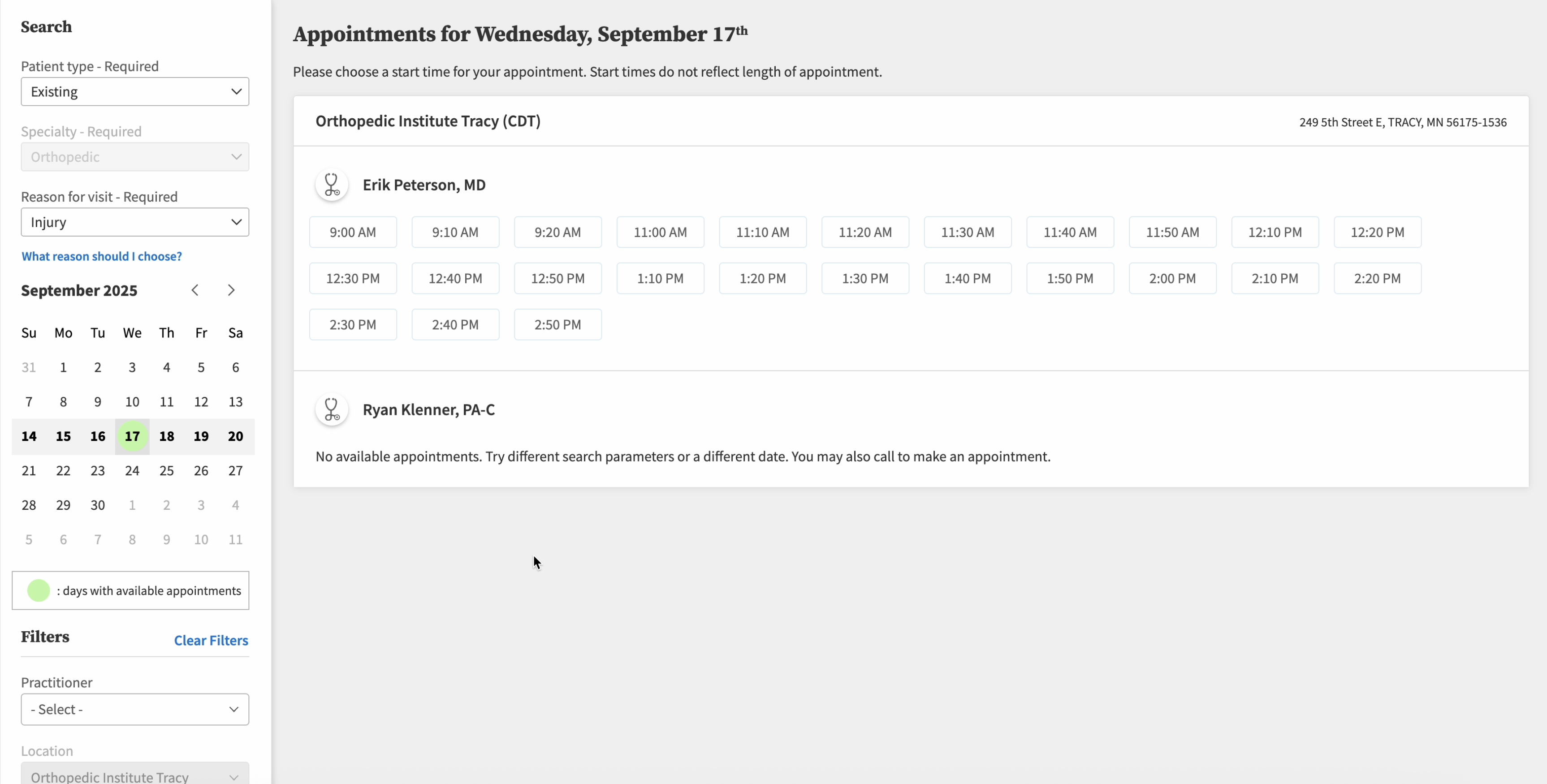
One upside is that when there was availability, patients found choosing a time quick and easy.
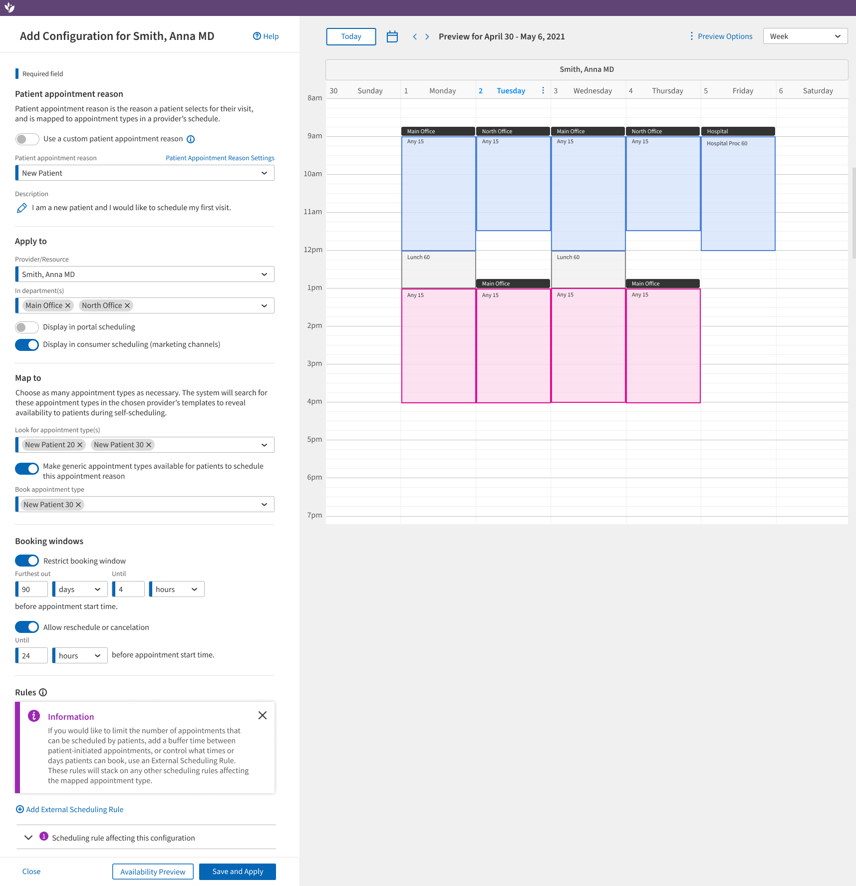
I worked on one round of iterations where Patient Self-Scheduling was configured in Schedule Builder. This round offered users a handful of custom patient appointment reasons they could add to the static list, a visual representation of slots that would be available for patients to book, and a clearer version of external scheduling rules. However, everything else was basically the same. It was an improvement over the old pages, but it didn't solve many of the underlying issues clients had with our product.
Two big opportunities rolled in for the team in summer 2025 — AI and LLMs reaching the point where it felt like they really understood our language and intent, and the business deciding that, with so few clients actively using patient self-scheduling, it would be okay to totally reimagine the backend architecture. The initial concept for "Enhanced Patient Self-Scheduling" was born alongside the concept that drove forward Scheduling Rules. I thought, "What if instead of tedious mapping and drop-downs, we just used an LLM?"
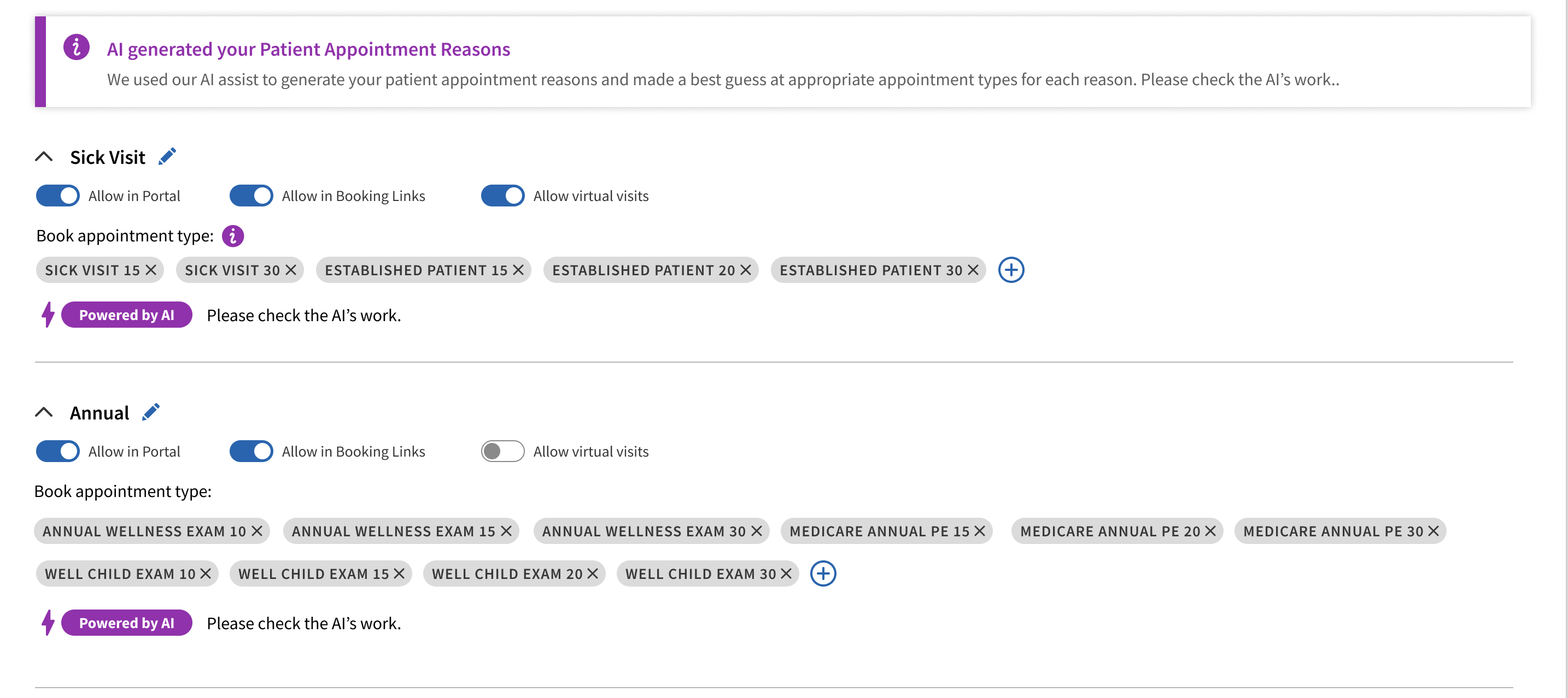
Early iterations with this idea had me imagining using an LLM to create groups of appointment types with generated patient-facing labels to replace static patient appointment reasons. Users could just enter the "types" of appointments they want patients to book online, like "follow-ups and new patients" and the AI would match that label to the appropriate appointment types.
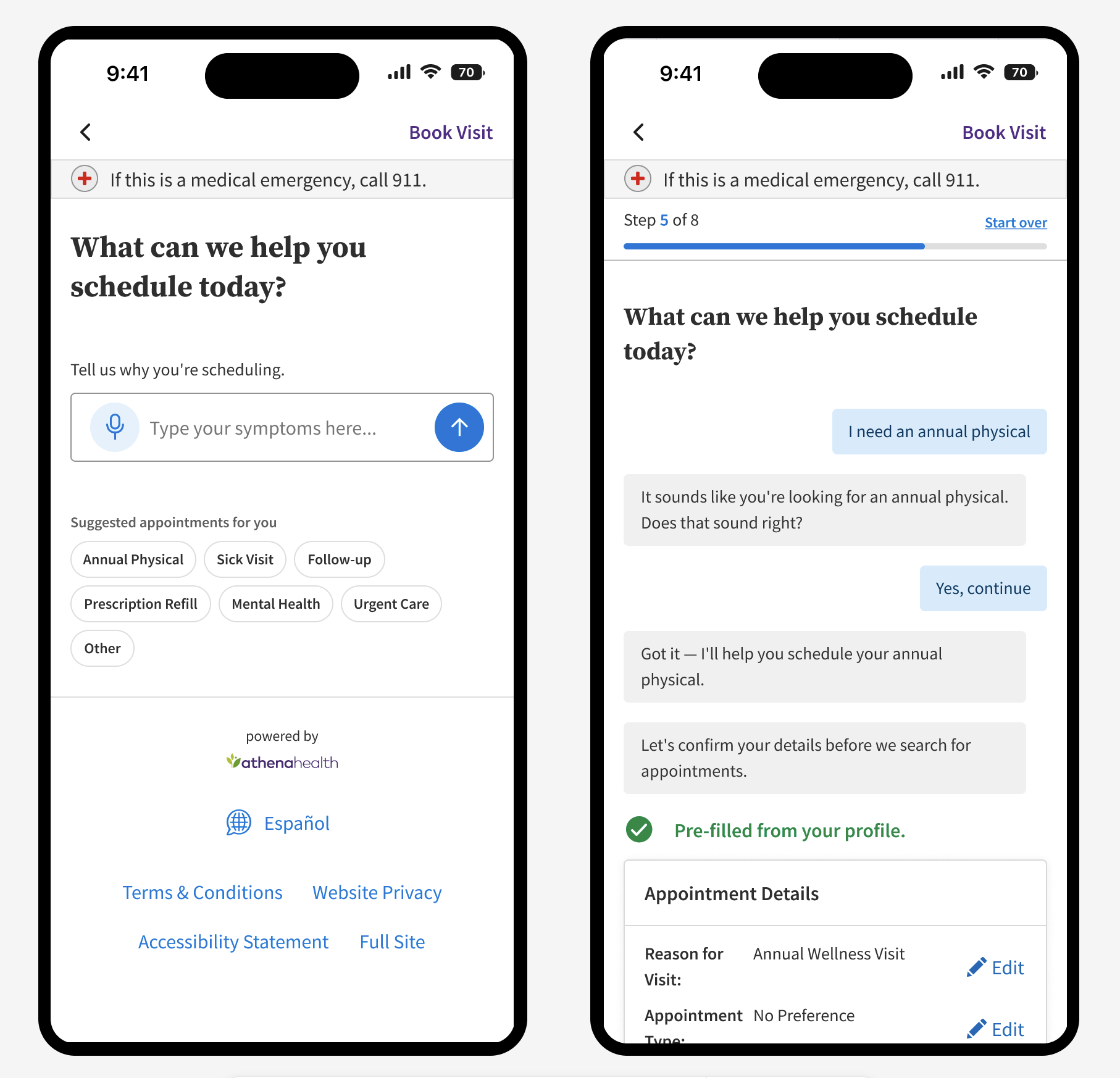
Instead of having patient appointment reasons map to appointment types and having patients scroll through those reasons in a drop-down, I wondered: could we just let practices enable appointment types for online scheduling, let patients describe their needs to an LLM, and have that LLM match them with the appointment type they need?
The open text box for symptoms/patient need would eliminate the issue of patients changing the drop-down to find any open slot. Instead they would be on guardrails based on their initial ask, guardrails leading to the correct appointment type.
We could even expand into inferring department, provider, and day and time needs from what the patient might type into the box. One of the engineers on my team created a quick prototype to prove LLM appointment type matching could work, and its success amazed and inspired us to continue down this road.
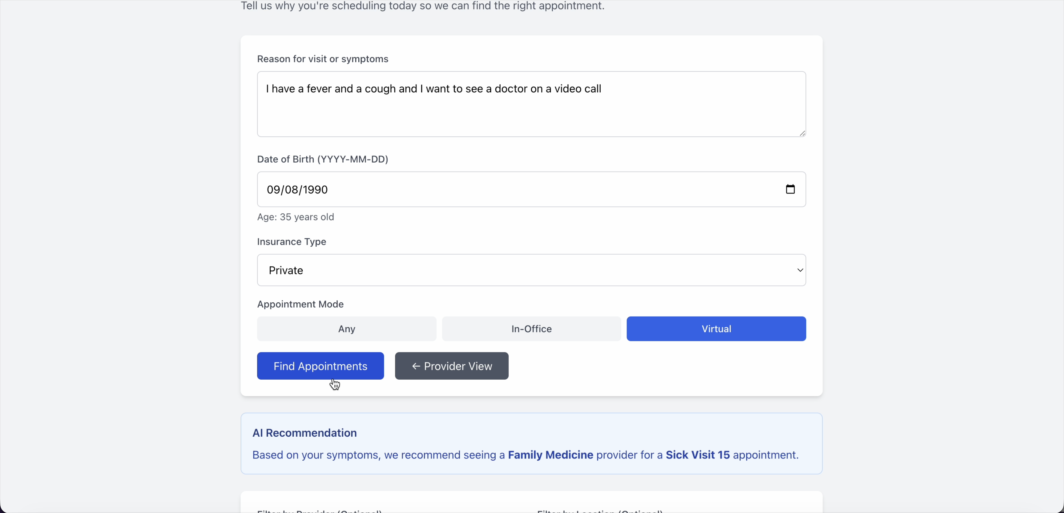
This screenshot is from my Windsurf prototype for patient self scheduling and rules. In this mock-up of the patient experience, the patient enters their reason for wanting a doctor's visit and AI matches their intent to the correct appointment type. Unfortunately, I do not have a screenshot of my engineer's prototype.
Removing patient appointment reasons would already be a huge backend change to patient self-scheduling. It would reduce a ton of setup work and old restrictions that frustrated so many clients. But another issue the old system had was a 3-tier hierarchy of provider assignment mappings. Users could, in theory, create a set of patient appointment reason mappings at the practice, department, or provider level. The interface for this feature was so convoluted that one of our staff spent over 200 hours trying to set up provider-level configurations for one new client.
As I iterated on the admin designs, I first tried to approach the settings hierarchy the same way as legacy, thinking this would reduce cognitive load when we switched clients over. But talking to clients, I realized they were already unfamiliar with the patient self-scheduling admin. After interviewing clients, I found out our true user was our internal team who onboarded clients — and they were definitely open to change.
I saw that the 3-tier system was difficult to understand, even with a new page layout. I wanted to preserve the flexibility and granularity the old system offered, but I found a simpler way. We just needed a default setting that would serve as a foundation for the practice, and the ability to create custom overrides. I thought it would be simpler to name the custom settings and assign them to whoever you wanted. That way, you could create custom settings not just for a whole department or one provider/department combo — you could apply custom settings to multiple departments, all providers who shared a specialty, a small group of providers, or a single provider across many departments — all things that were very tedious to achieve in the old system.
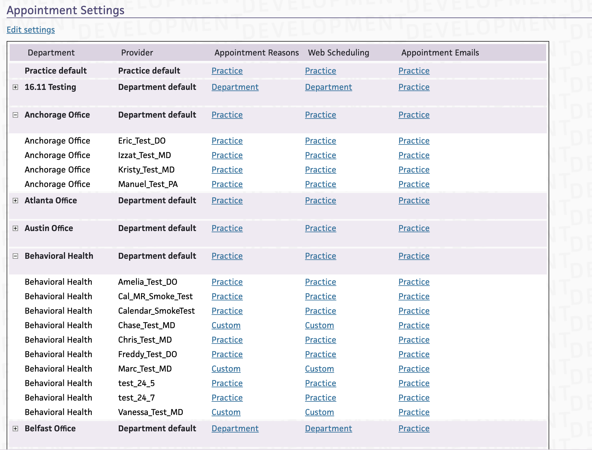
Old assignment table
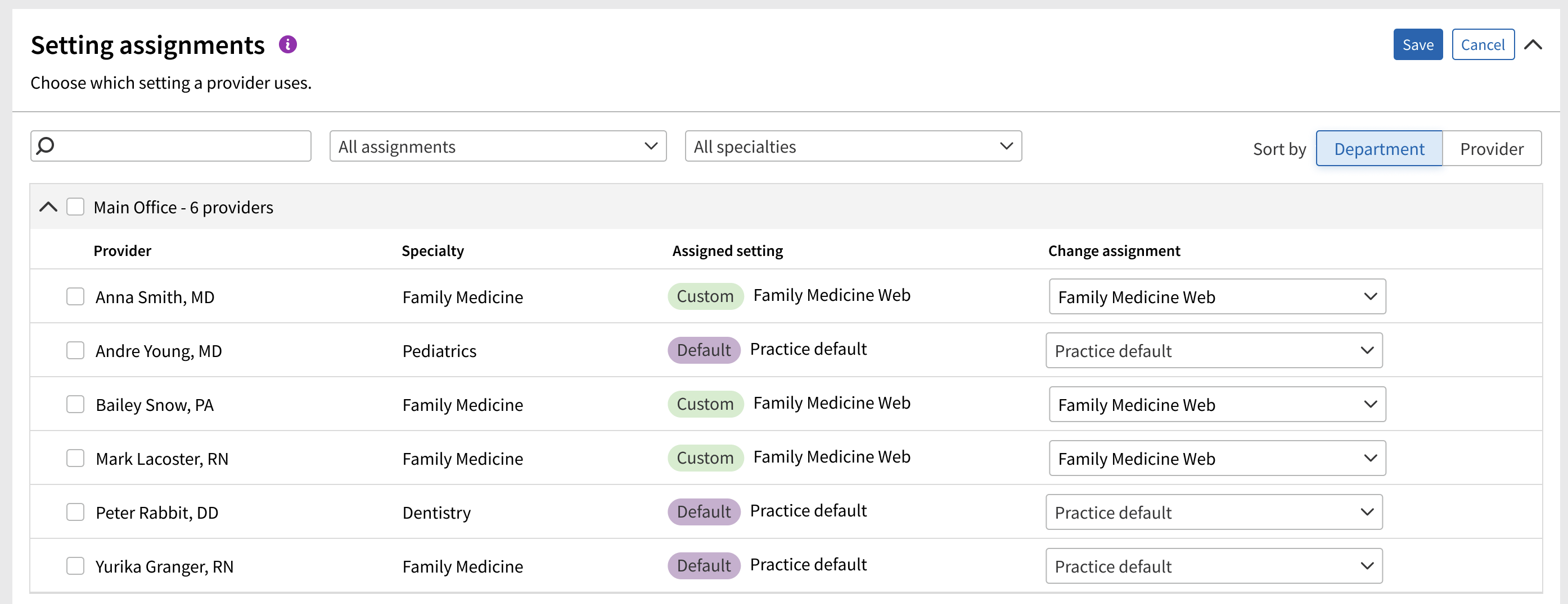
New assignment table
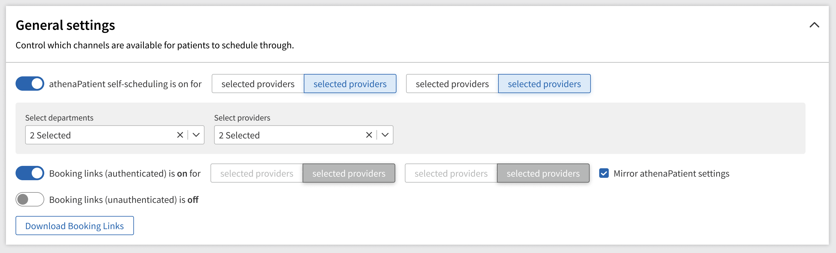
Two other improvements we made to the admin experience were adding master on/off switches so clients could control which doctors were available to be booked online, and which channels patients could book through.
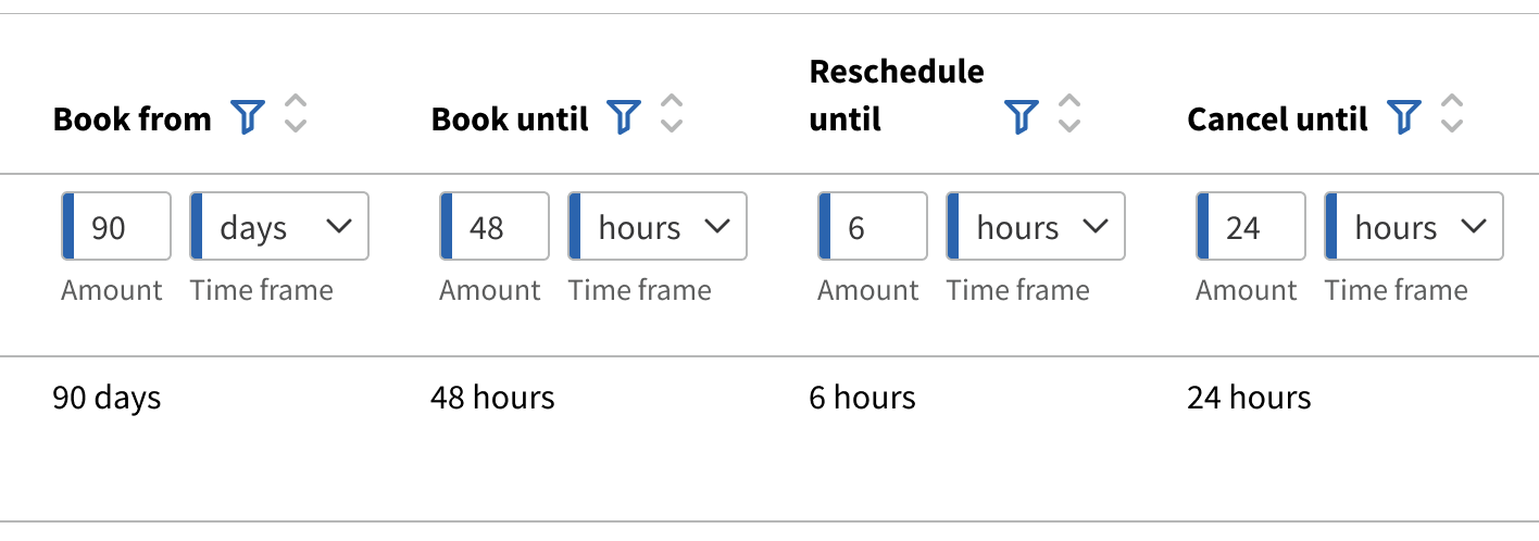
The old system required a combined window for minimum booking time and cancelation. Clients repeatedly asked for these to be separate, so we did that and added a reschedule window while we were at it, giving practices even more control and flexibility.
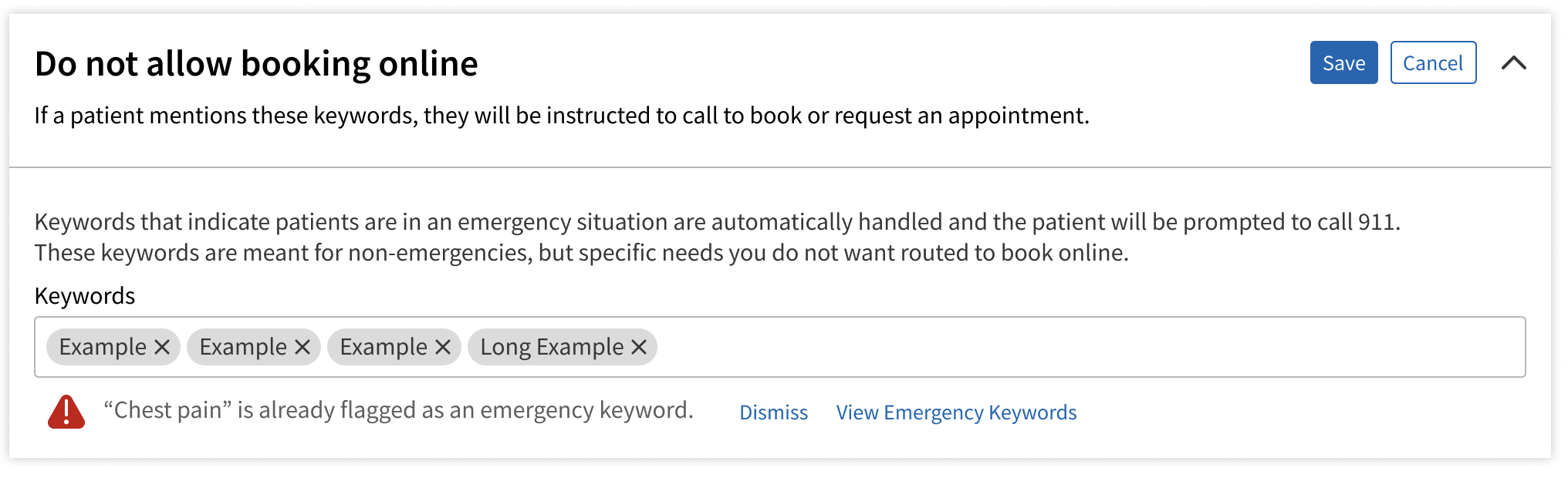
During user interviews, we learned there are specific things practices want patients to call in about instead of booking online. To help the LLM match appointment types for patients, I designed a keyword management system. If patients use these keywords, the LLM would know to direct them to a phone number rather than let them schedule online.
I did user testing with a prototype I made myself with Claude Code. It was so amazing to test with a prototype where users could click on everything, try out real behaviors, and create content like they would in the real world. It was so much better than prototypes of the past that had just one place to click and dummy data! We interviewed the subject matter experts — our main users, the onboarding team. It's not humble to say it this way, but there's no way around it — they LOVED it! Below are some quotes from their reactions.
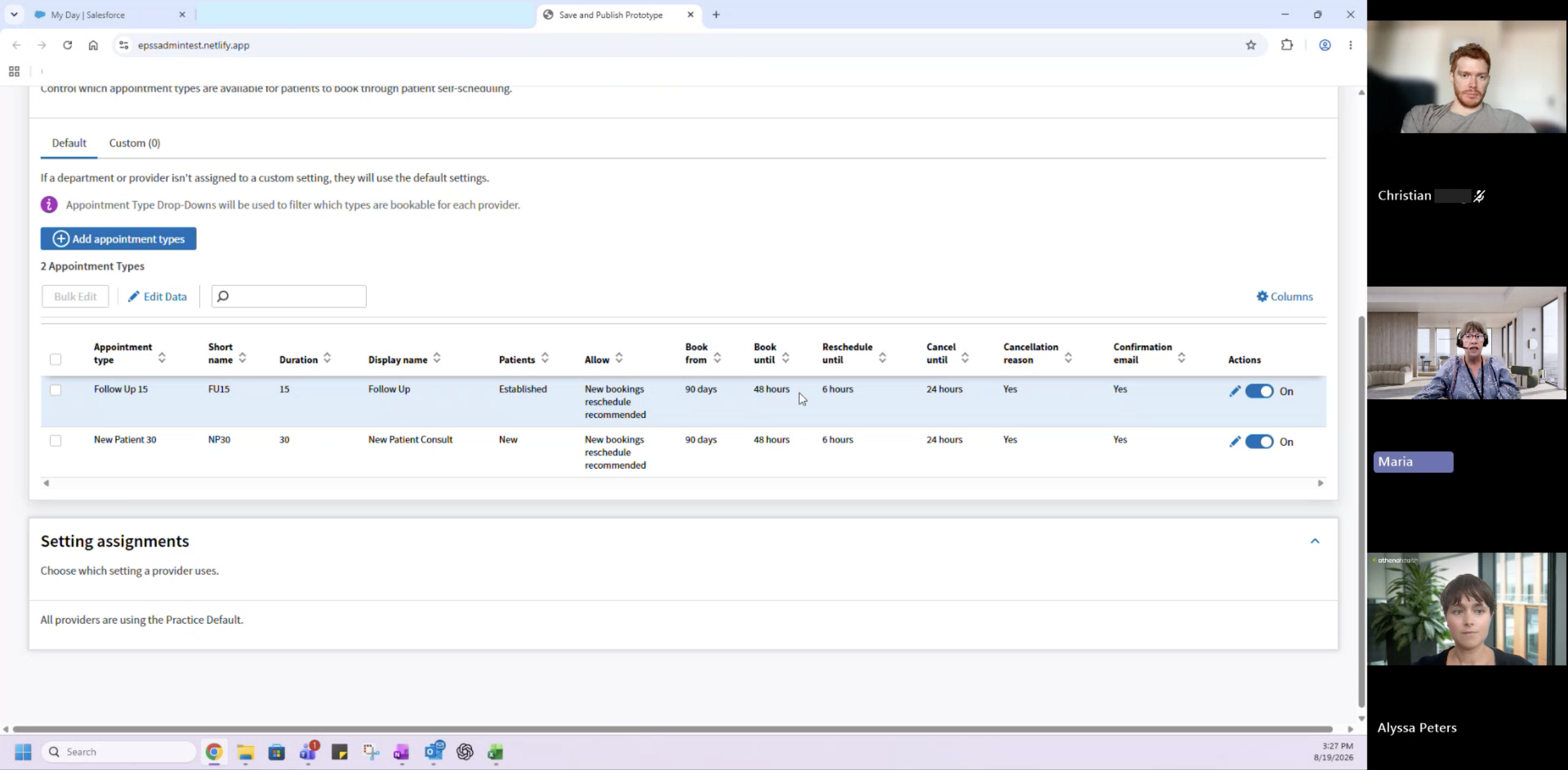
“It's just the PARs were the biggest headache of all, especially for the specialty practices... So this looks really easy. I like that they can make changes all at once for those custom settings. It looks really user-friendly... You've covered pretty much all of our headaches just right here in one, so I love it. Clients would love it.”
“It's just gonna streamline the process so much, especially for those larger clients. Like, the time savings is gonna be incredible.”
“I feel like we're going to get more buy-in from clients to allow us to have them use us for their scheduling.”
“I think this is phenomenal. This is gonna be like, light years above what we currently have.”
Another designer collaborated with me and led the designs for the patient experience. I held more of a consultant role for these designs. I needed to communicate the vision of keeping the patient on guardrails toward the appointment they really needed, and to make sure my coworker and I were aligned on the vision of using the LLM — and that we both understood how the admin configurations would be reflected in what the patient sees.
Patient self-scheduling was one of the first projects at our company to try to use spec-driven development to utilize AI to expedite development. Although the opportunity was shiny — way faster development, allowing us to be super ambitious with our scope — we were all new to the tools and the processes. We learned what worked and what needed to change as we tried to build this product vision, and our deadlines crept nearer.
I can go into more depth if you talk to me in person, but the end result was a continuous adjustment of expectations. The scope was reduced for our alpha release, but the foundation is being set and the vision is currently in development — it's just going to take a little longer than we originally hoped.