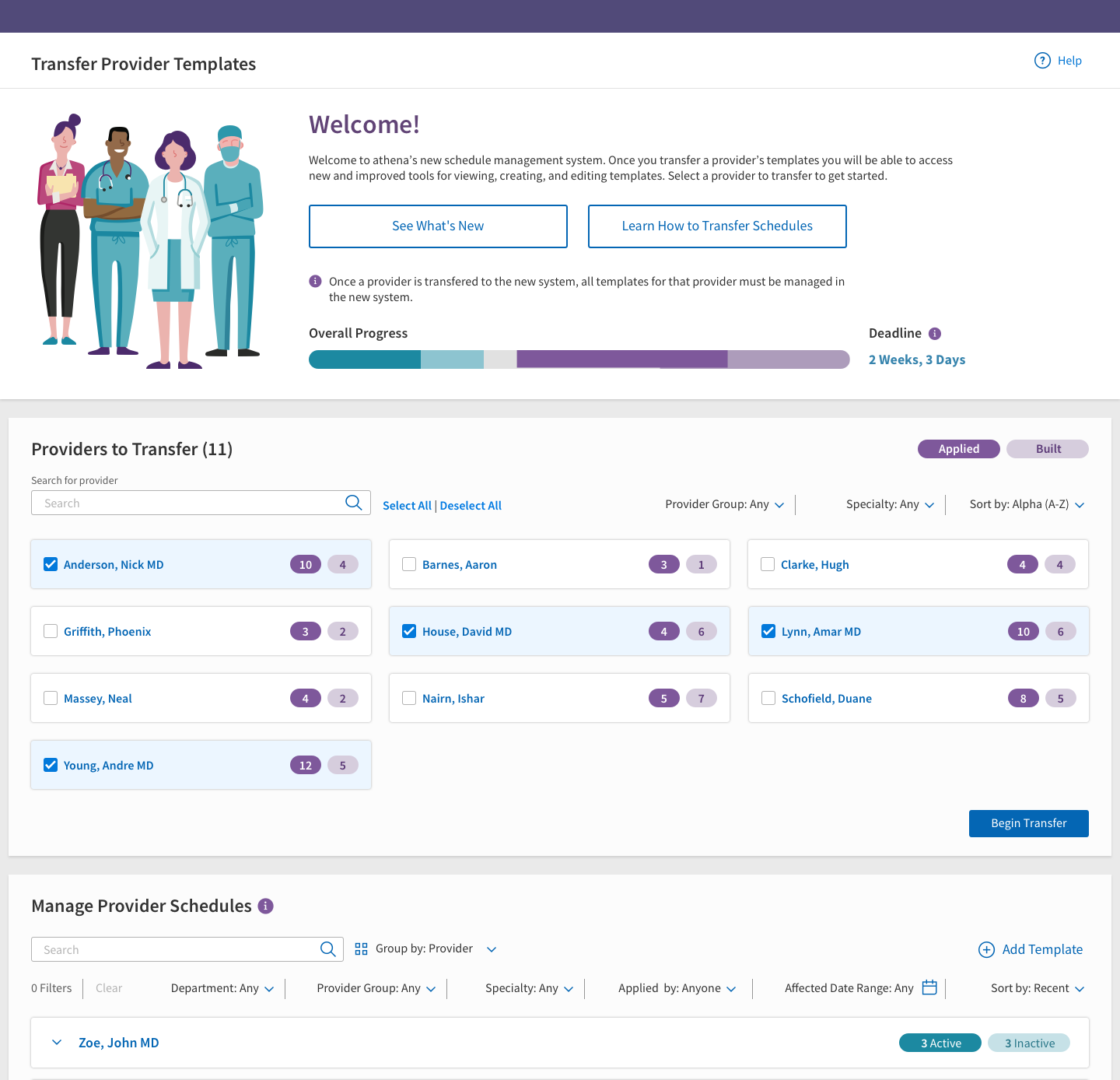
Completed design
An example of Schedule Builder in use for a real practice
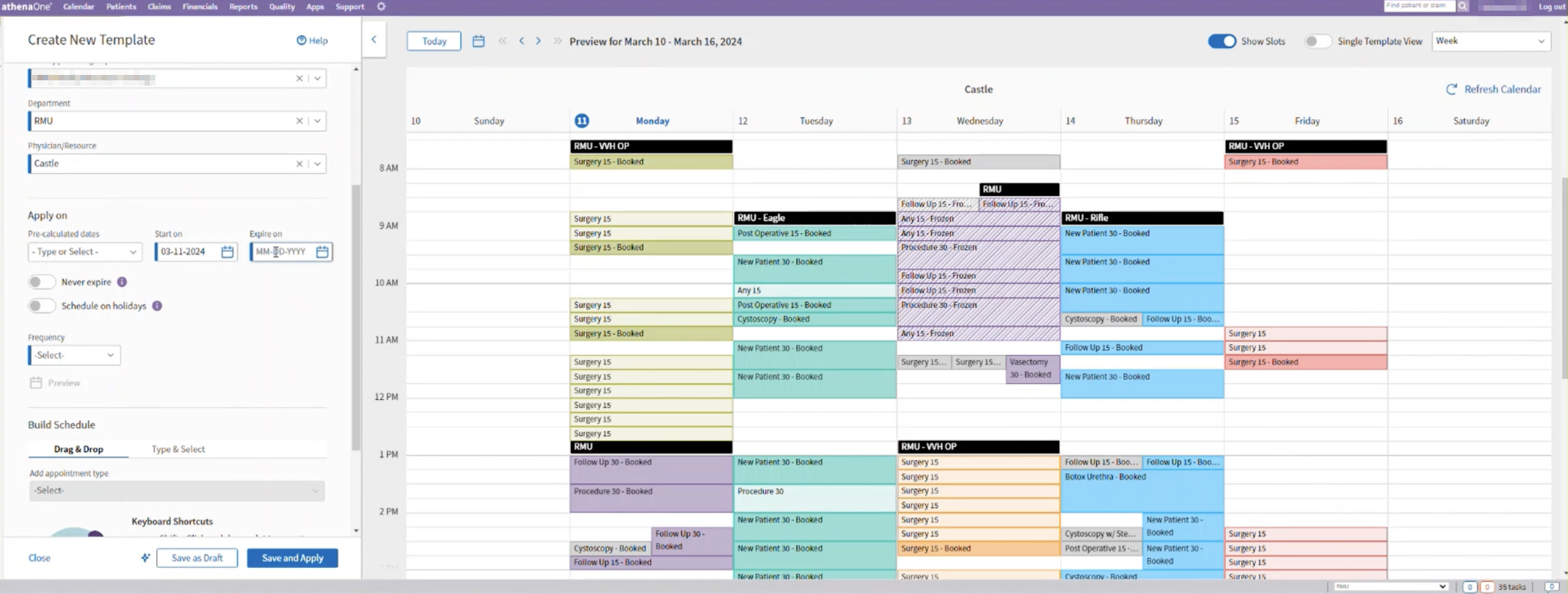
Giving admins the one thing the legacy tool never had: a way to actually see the schedule they were building.
An example of Schedule Builder in use for a real practice
The appointment life cycle in our product started with creating the provider's schedule. When was the provider available, where, and for what types of appointments? In the legacy scheduling tool, the way users achieved this was by creating “templates” which contained appointment types in set time slots. The template was then “applied” to certain days. The process was two separate steps, on two separate admin pages.
athenahealth is an electronic health records company, or as I like to explain it, we make software for doctor's offices. I worked on scheduling features.
Company ContextThe first step of the process was gaining a deep understanding of the current state of the software, users' needs and jobs to be done, and the history of feedback and attempts at redesigns that came before this one. I explored the legacy software and took part in stakeholder and user interviews with two other designers on my team.
The legacy tool didn't just look outdated — it encouraged bad habits.
The Problem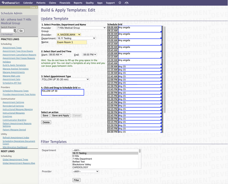
To build a template, users chose their provider, department, and a start and end time for the template. They then chose appointment types and dragged them onto the schedule grid.
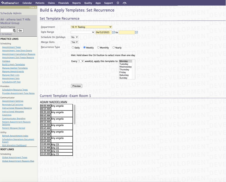
In a separate step, the template build is "applied" to certain days with different repeat functions. Think of it like "stamping" a build onto a provider's schedule.
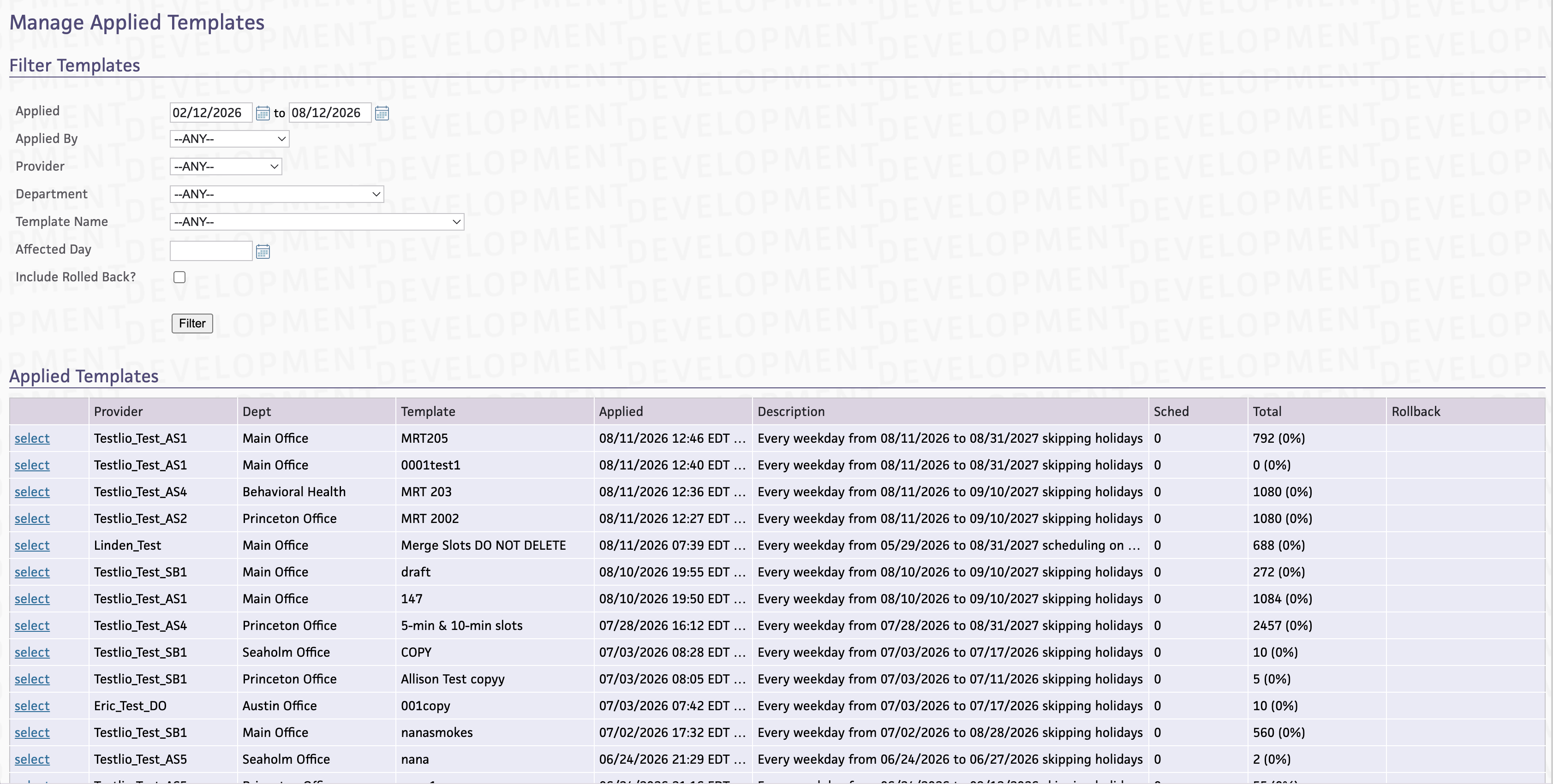
The only way to view all the templates affecting the schedule was in a table view.
I created a set of low-fidelity wireframes to communicate ideas around a new and more flexible way to set a provider's schedule.
Stakeholders got genuinely excited about this future state, and I became the sole designer carrying it forward.
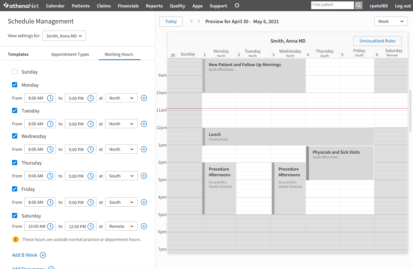
Set the provider's "working hours"
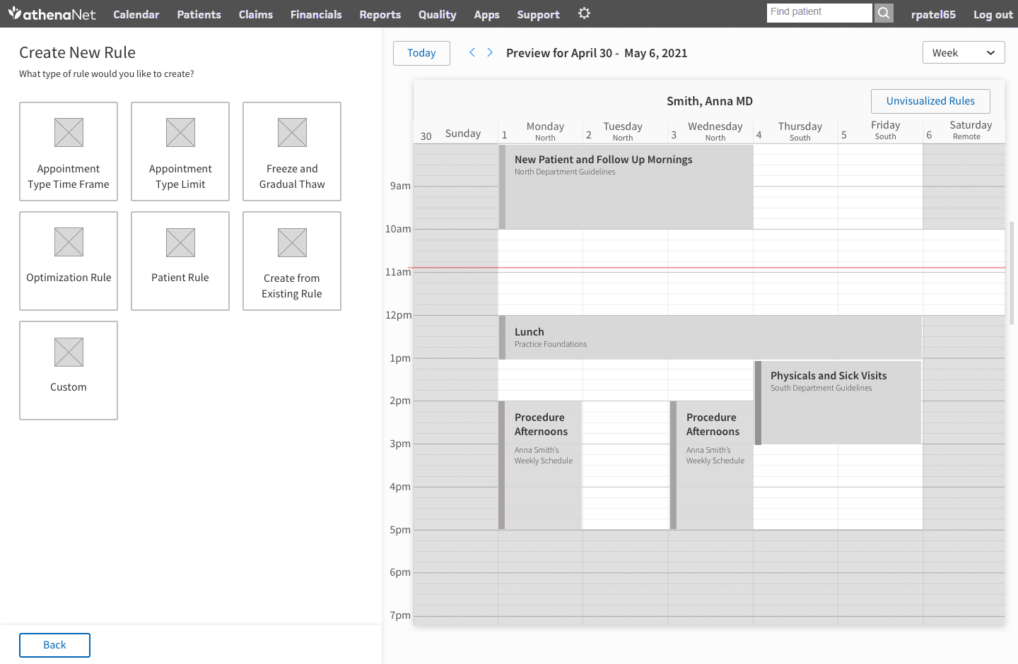
Choose from a set of schedule rules
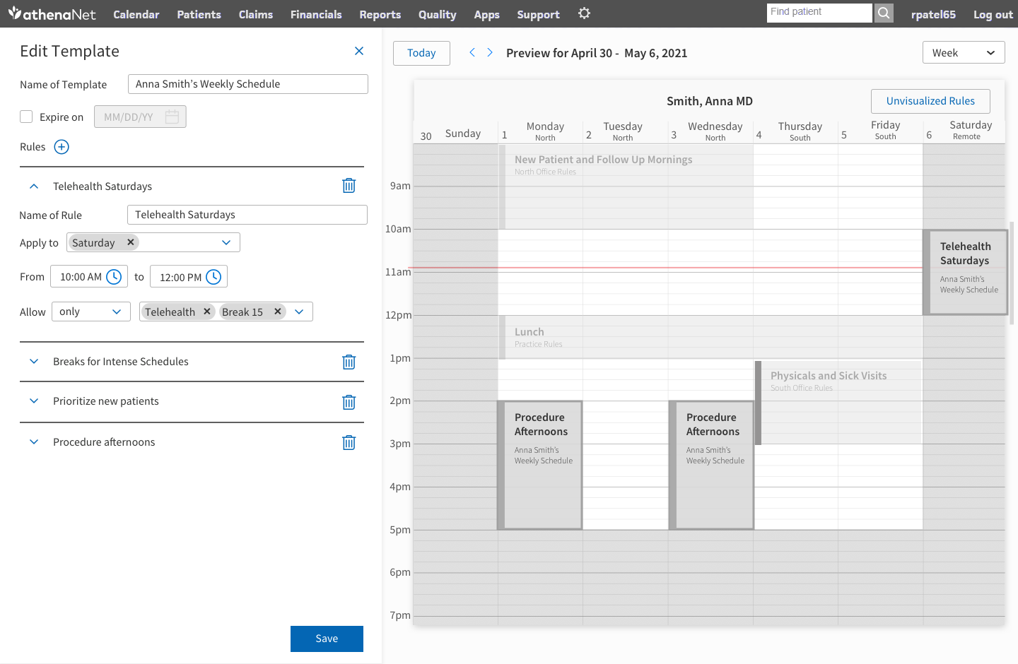
Set rule parameters
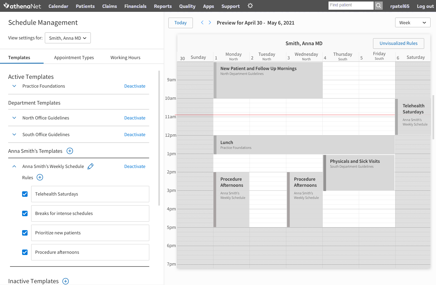
View all rules dictating how appointments are scheduled within the provider's schedule
To migrate our full client base onto the new tool, we had to keep the existing backend architecture. That meant this wasn't going to be a ground-up reinvention from the wireframes, it was going to be a UX transformation built on the bones of the old system, setting a foundation for driving towards the full vision in the future. Working closely with our developers, we mapped what could realistically change now versus later.
What stuck, and what won over our clients, was the schedule visualization. For the first time, admins could see every template applied to a provider's schedule, how they overlapped, and what was actually governing a given day — solving the single biggest source of confusion in the old tool, without needing to touch the backend that generated it.
I worked on proof-of-concept designs that rolled back the vision designs to something we could actually develop. I improved the user experience while keeping the underlying actions and data the same, with the addition of the schedule preview.
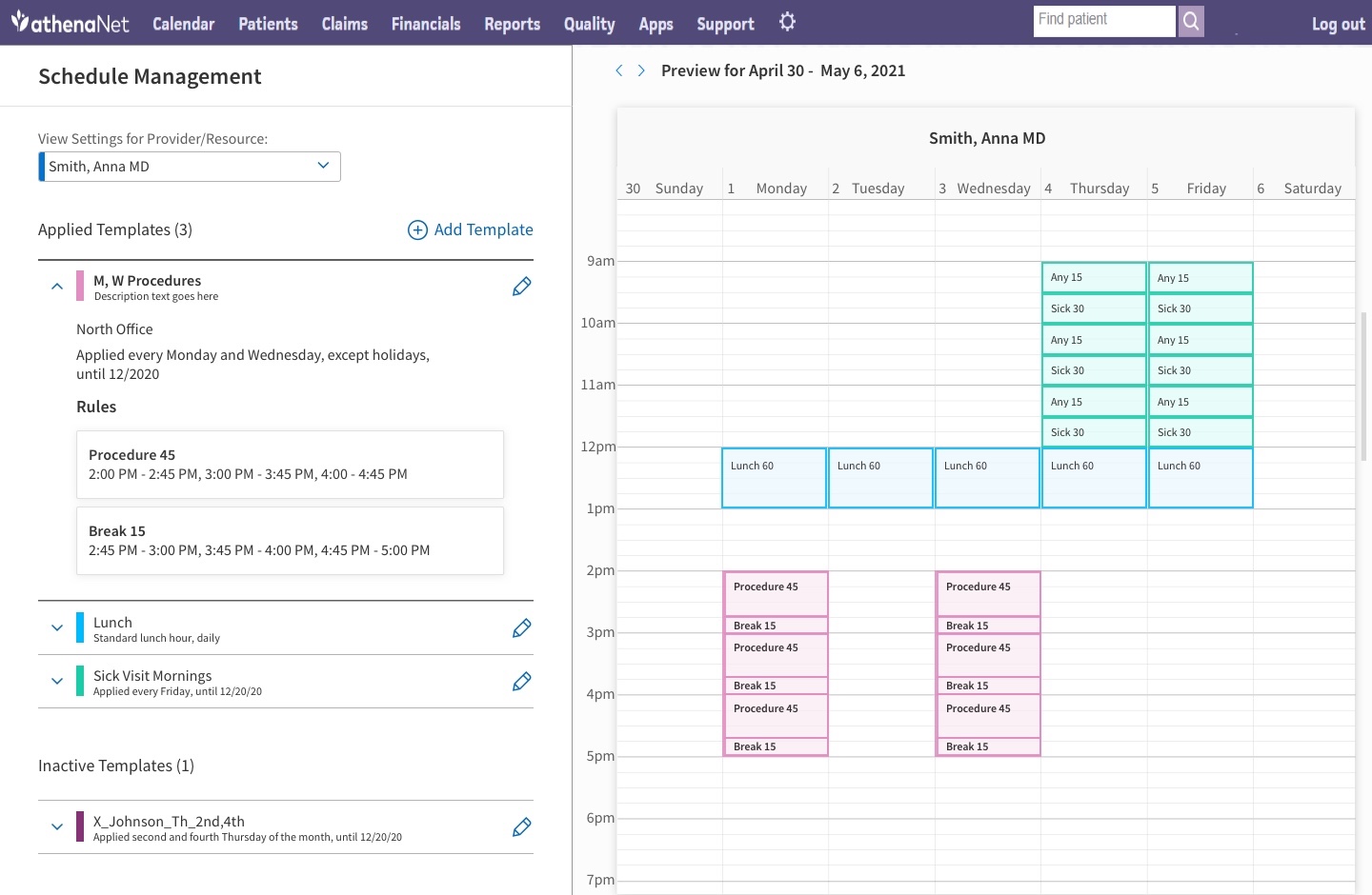
View all the provider's applied templates in a list and visual preview
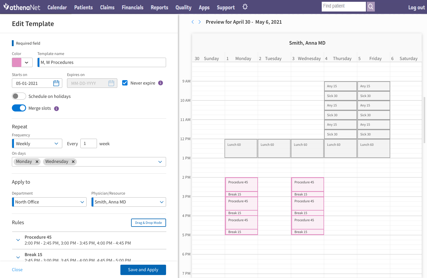
Create a template with the build and apply options in one step
Rolling out to real clients surfaced needs the wireframes hadn't anticipated. Anticipating a future where schedules were governed by rules rather than slots, I had created a forms based approach to building the schedule, but users missed drag-and-drop, so we added it in. Some clients were running 24-hour schedules in 5-minute increments, which made the schedule preview unreadable and occasionally crashed the app; we solved it by adding the ability to view appointments in blocks rather than slots, and adding the ability to zoom in and out in the preview.
Schedule Builder now runs 100% of athenahealth's clients — thousands of practices managing many thousands of provider schedules, with the legacy tool fully retired. Because everyone has moved to the modernized UI, we were able to introduce net-new features like group appointments for therapy and room/block scheduling for Ambulatory Surgical Centers. Schedule Builder also became the pattern other teams pointed to when making the case that legacy tools could be modernized.

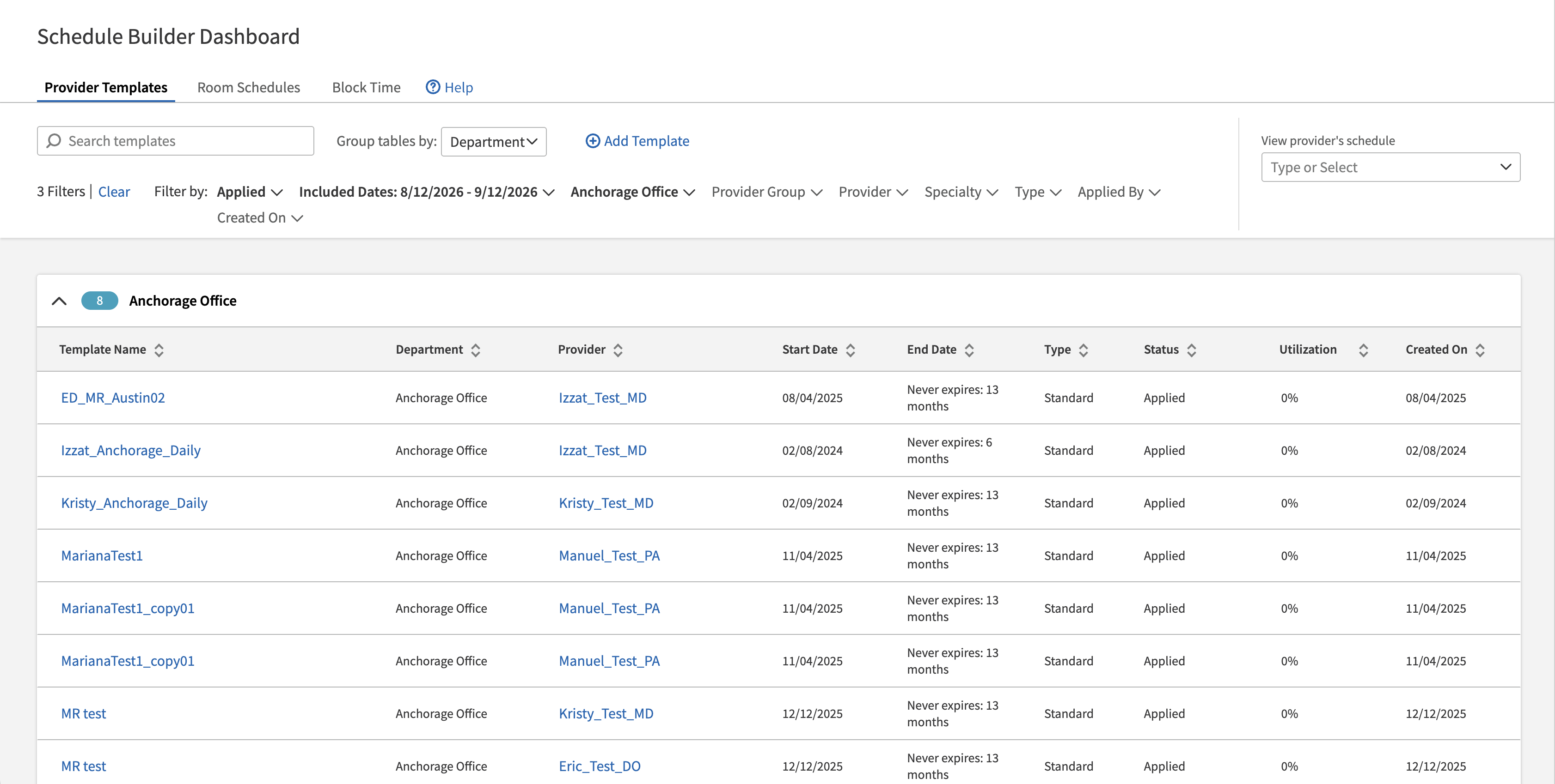
We preserved the table view for faster browsing and to preserve legacy behavior for clients used to their workflow. We added better filtering and grouping, as well as the quick ability to click on a provider to view their schedule visually.
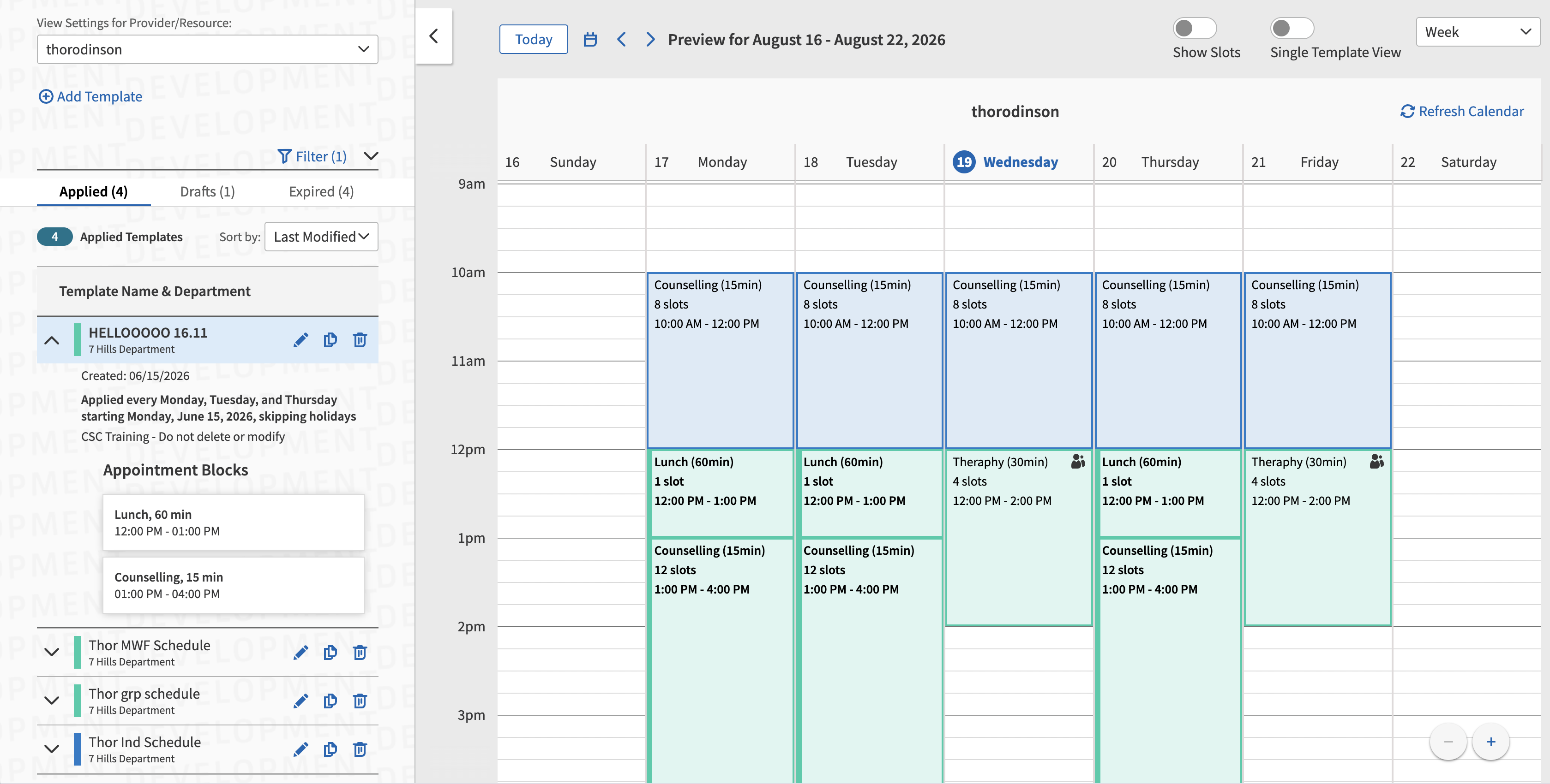
View the provider's template list, highlight single templates to see what they contribute to the schedule, and choose between viewing templates in blocks or slots. This screenshot shows blocks, which improves load performance.
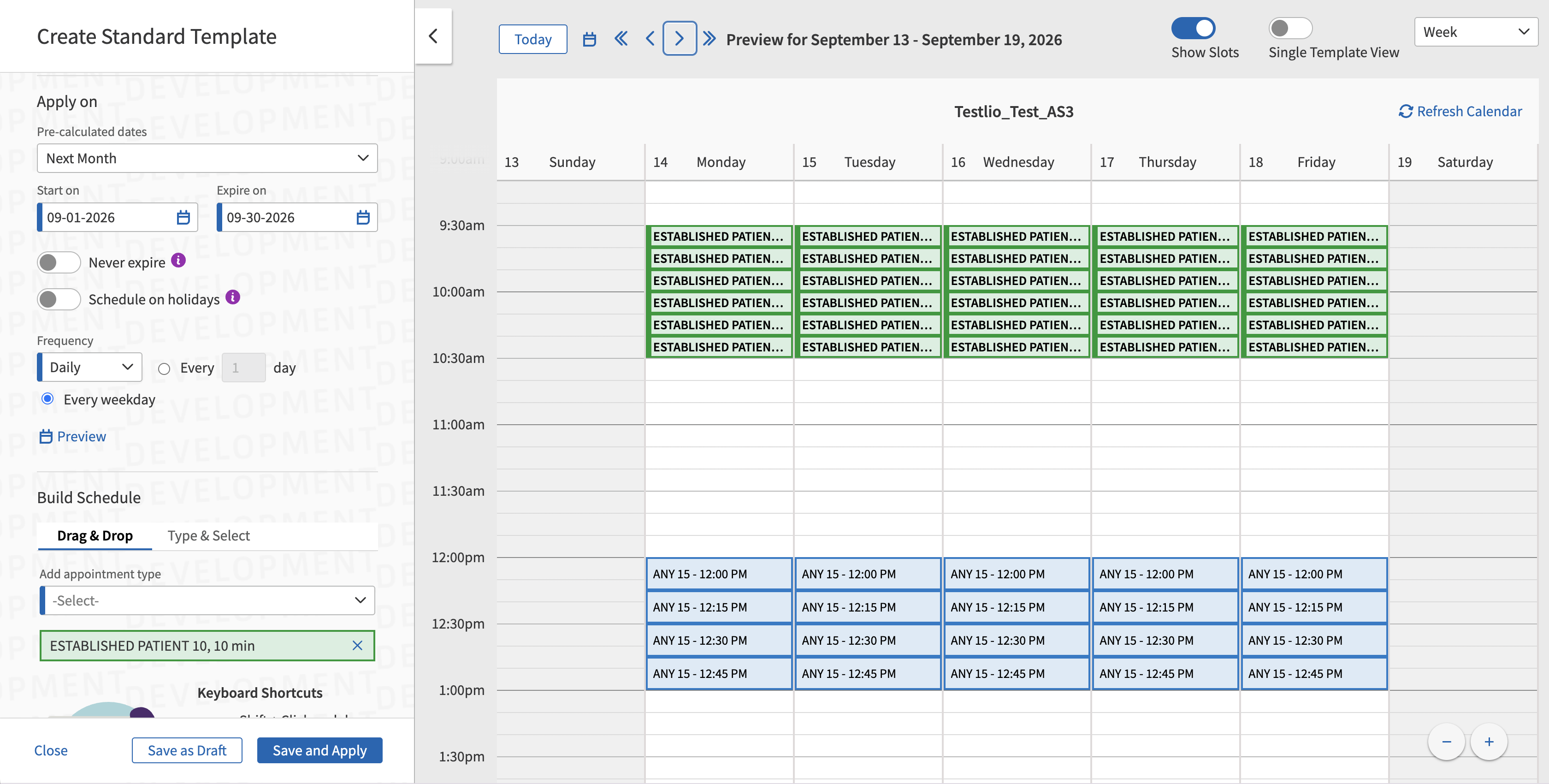
Creating a template combines the build and apply steps and includes drag and drop and form mode for flexibility for the users. Users can see the visual preview of the template they are building to avoid unwanted conflicts.
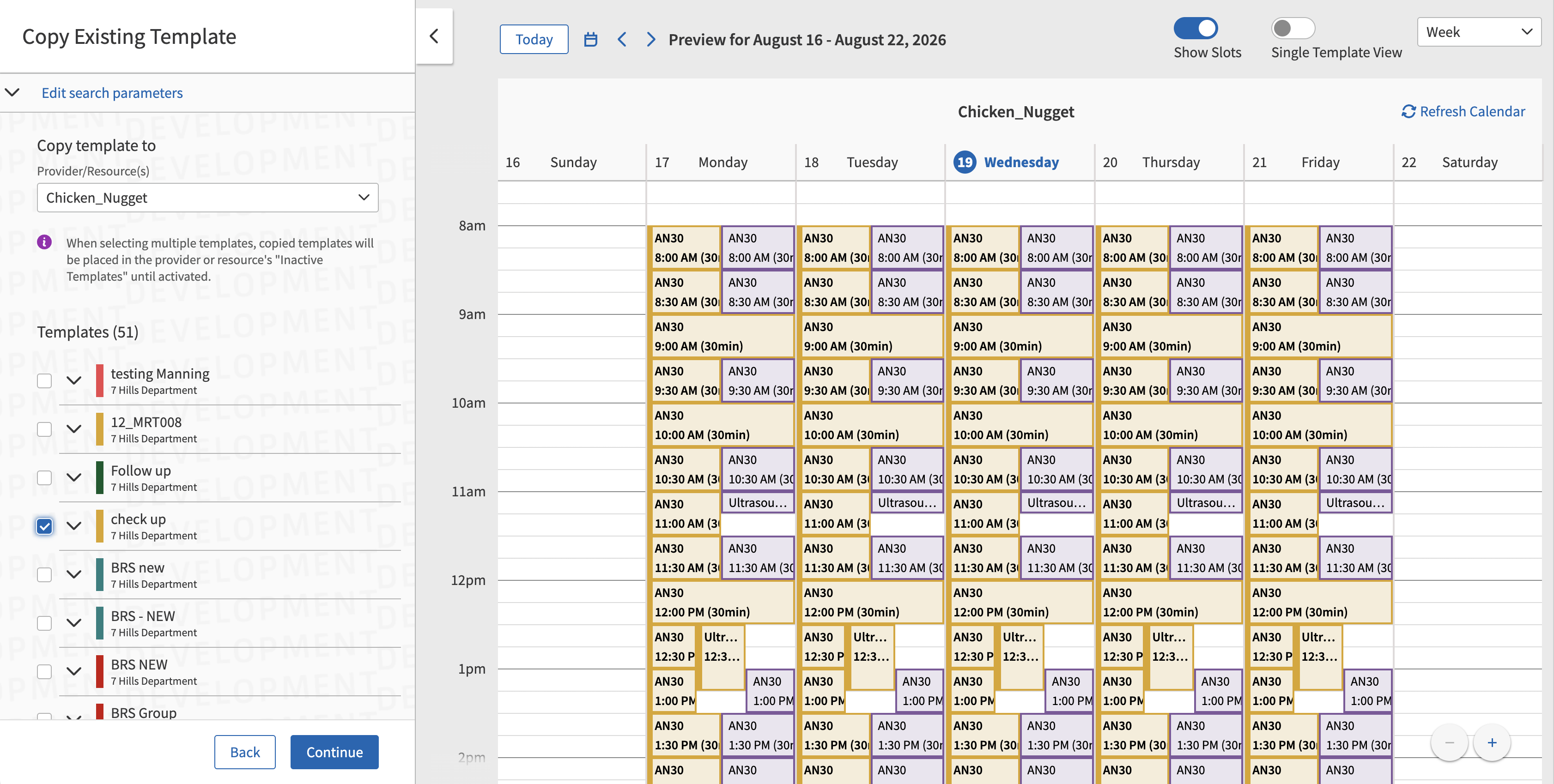
Users can quickly copy completed templates to a new provider, first seeing how the copied templates interact with the provider's current templates, then making necessary tweaks before applying.
Looking back, I'd change how we handled the transition itself. We designed toward the future-state vision and rolled it back into an MVP for migration — which meant the "why" behind a lot of decisions was invisible to users experiencing a slow, incremental rollout. I think a version that stayed closer to what users already knew, and changed more gradually, would have caused less pain. We also had designs for a transfer dashboard meant to ease the transition to new from legacy, but it got cut for time and budget. I think the dashboard, along with more hands-on training, would have solved a lot of what users struggled with.